パララックスエフェクトの基本:jQuery×HTML5×CSS3を真面目に勉強(1)(3/4 ページ)
» 2013年03月22日 14時40分 公開
[山田 直樹,クラスメソッド]
Sample #4 | 背景画像を動かしてみる
ページを複数のセクションに分け、それぞれにある背景イメージをスクロールで動かしてみます。
<!DOCTYPE html>
<html>
<head>
<meta charset="UTF-8">
<title>Move images | Learning Parallax effect</title>
<link rel="stylesheet" href="css/moveImages.css">
</head>
<body>
     <h1>背景画像を上下に動かす</h1>
     <p id="indicator" class="indicator">スクロール値 | <span id="scrollValue">0</span></p>
     <section id="section1">
          <p>Section 1</p>
     </section>
     <section id="section2">
          <p>Section 2</p>
     </section>
     <section id="section3">
          <p>Section 3</p>
     </section>
     <section id="sectionAshColor">
          <p>Section Ash color</p>
     </section>
     <section id="section4">
          <p>Section 4</p>
     </section>
     <section id="sectionRedColor">
          <p>Section Red color</p>
     </section>
<script src="http://code.jquery.com/jquery-1.9.1.min.js"></script>
<script src="js/moveImages.js"></script>
</body>
</html>
HTML
body {
     height: 3300px;
}
h1 {
     font-size: 100%;
}
.indicator {
     margin: 0;
     position: fixed;
     right: 10px;
     top: 10px;
}
.indicator {
     background: rgba(255, 255, 255, 0.8);
}
section {
     height: 1050px;
}
section p {
     color: #fff;
     margin: 0;
     padding: 8px;
}
#section1 {
     background: url(../img/bg-parallaxsample01.jpg) repeat-x;
}
#section2 {
     background: url(../img/bg-parallaxsample02.jpg) repeat-x;
}
#section3 {
     background: url(../img/bg-parallaxsample03.jpg) repeat-x;
}
#section4 {
     background: url(../img/bg-parallaxsample04.jpg) repeat-x;
}
#sectionAshColor {
     background: #666;
}
#sectionRedColor {
     background: #900;
}
CSS
$(function() {
     var section2PosTop = $('#section2').offset().top;
     var section3PosTop = $('#section3').offset().top;
     var ashPosTop = $('#sectionAshColor').offset().top;
     $(window).scroll(function() {
          var value = $(this).scrollTop(); //スクロール値を取得
          $('#scrollValue').text(value);
          $('#area1').css('background-position-y', value);
          if (value > section2PosTop) {
               $('#section2').css('background-position-y', value - section2PosTop);
          } else {
               $('#section2').css('background-position-y', 'top');
          }
          if (value > section3PosTop) {
               $('#section3').css('background-position-y', (value - section3PosTop)*2);
          } else {
               $('#section3').css('background-position-y', 'top');
          }
          if (value > ashPosTop) {
               var section4Top = value - ashPosTop - 800;
               $('#section4').css('background-position-y', section4Top);
          } else {
               $('#section4').css('background-position-y', -200);
          }
     });
});
JavaScript
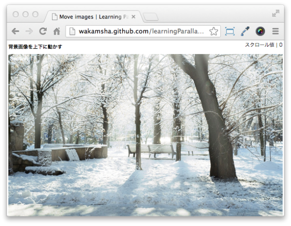
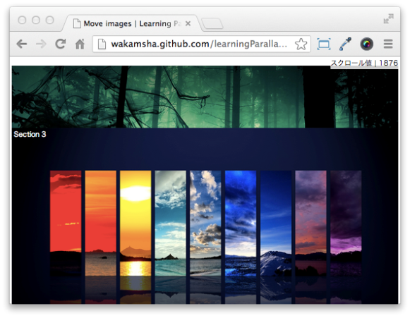
section1とsection2は、画面の一番上までくるとその位置で固定されます。section3は、一番上までくると今度は下方向に下がっていく動きをします。section4は画面一番上まで上がらずに途中で位置が固定され、その上をsection red colorが通過するといった動きをします。
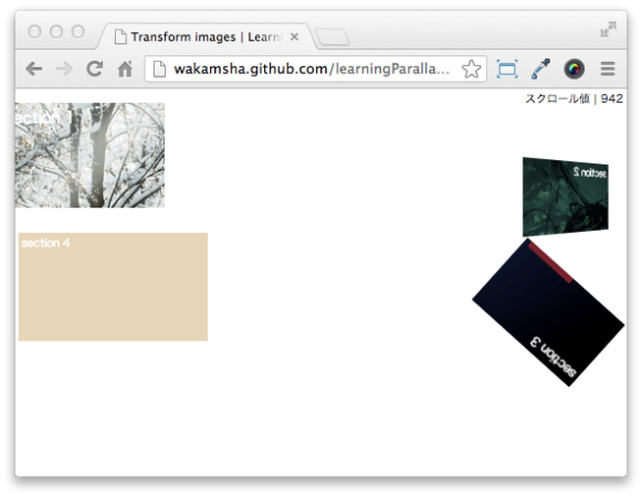
Sample #5 | 要素をさまざまな形に変形させてみる
せっかくなのでスクロールによる縦横の動きだけでなく、CSS3の機能で少し遊んでみましょう。スクロール値を使ってTransformプロパティや不透明度も操作してみるとします。
<!DOCTYPE html>
<html>
<head>
<meta charset="UTF-8">
<title>Transform images | Learning Parallax effect</title>
<link rel="stylesheet" href="css/transformImages.css">
</head>
<body>
     <h1>画像をさまざまな形に変形させる</h1>
     <p class="indicator">スクロール値 | <span id="scrollValue">0</span></p>
     <section id="section1">
          <p>section 1</p>
     </section>
     <section id="section2">
          <p>section 2</p>
     </section>
     <section id="section3">
          <p>section 3</p>
     </section>
     <section id="section4">
          <p>Area 4</p>
     </section>
<script src="http://code.jquery.com/jquery-1.9.1.min.js"></script>
<script src="js/transformImages.js"></script>
</body>
</html>
HTML
body {
     height: 3300px;
}
h1 {
     font-size: 100%;
}
.indicator {
     margin: 0;
     position: fixed;
     right: 10px;
     top: 10px;
}
section {
     background-size: 100%;
     height: 200px;
     position: fixed;
     width: 314px;
}
section p {
     color: #fff;
     margin: 0;
     padding: 8px;
}
#section1 {
     background: url(../img/bg-parallaxsample01.jpg) no-repeat;
     left: 30px;
     -webkit-transform: scale(0.5, 0.5);
     -moz-transform: scale(0.5, 0.5);
     -ms-transform: scale(0.5, 0.5);
     -o-transform: scale(0.5, 0.5);
     transform: scale(0.5, 0.5);
}
#section2 {
     background: url(../img/bg-parallaxsample02.jpg) no-repeat;
     top: 200px;
     right: 0;
}
#section3 {
     background: url(../img/bg-parallaxsample03.jpg) no-repeat;
     top: 520px;
     right: 60px;
     -webkit-transform: scale(2, 2);
     -moz-transform: scale(2, 2);
     -ms-transform: scale(2, 2);
     -o-transform: scale(2, 2);
     transform: scale(2, 2);
}
#section4 {
     background: url(../img/bg-parallaxsample04.jpg) no-repeat;
     height: 300px;
     top: 400px;
     width: 528px;
     opacity: 0;
}
CSS
$(function() {
     $(window).scroll(function() {
          var value = $(this).scrollTop(); //スクロール値を取得
          $('#scrollValue').text(value);
          var hoge1 = value * 0.001 + 0.5;
          if (hoge1 > 0.5) {
               $('#section1').css('transform', 'scale(' + hoge1 + ')');
          }
          if (hoge1 > 0.1) {
               $('#section2').css('transform', 'perspective(1000px) rotateY(' + value + 'deg)');
          }
          var hoge3 = 2 - value * 0.0009;
               $('#section3').css('transform', 'scale(' + hoge3 + ') rotate(' + value + 'deg)');
          var hoge4 = value * 0.0009;
          if (hoge4 <= 1) {
               $('#section4').css('opacity', hoge4);
          }
     });
});
JavaScript
Sample #6 | CSSだけでパララックスエフェクト
ごくシンプルな動きとなりますが、JavaScriptを一切使用せずにCSSだけでパララックスを実現させてみましょう。
<!DOCTYPE html>
<html>
<head>
<meta charset="UTF-8">
<title>Only CSS | Learning Parallax effect</title>
<link rel="stylesheet" href="css/parallax.css">
</head>
<body>
    <section id="first" class="content">
        <p class="logo">jQUery x HTML5 x CSS3</p>
        <article>
            <h1>Parallax sample.</h1>
            <p>Lorem ipsum dolor sit amet, consectetur adipisicing elit, ....</p>
        </article>
    </section>

    <section id="second" class="content">
        <article>
            <h2 id="toc-only-css">Only CSS.</h2>
            <p>Lorem ipsum dolor sit amet, consectetur adipisicing elit, ....</p>
        </article>
    </section>

    <section id="third" class="content">
        <article>
            <h2 id="toc-without-jquery">Without jQuery</h2>
            <p>Lorem ipsum dolor sit amet, consectetur adipisicing elit, ....</p>
        </article>
        <img src="images/guernica.jpg" />
    </section>

    <section id="theend" class="content">
        <h2 id="toc-the-end">The End.</h2>
    </section>
<script src="http://code.jquery.com/jquery-1.9.1.min.js"></script>
</body>
</html>
HTML
.content {
     position: relative;
}
#first  { background: url(../img/bg-parallaxsample01.jpg) 50% 0 no-repeat fixed; }
#second { background: url(../img/bg-parallaxsample02.jpg) 50% 0 no-repeat fixed #000; }
#third  { background: url(../img/bg-parallaxsample03.jpg) 50% 0 no-repeat fixed #000; }
#theend { background: url(../img/bg-parallaxsample04.jpg) 50% 0 no-repeat fixed #e6cda4; }
/* section first */
.logo {
    position: fixed;
    top: 100px;
    left: 50px;
}
#first article {
    position: absolute;
    top: 200px;
    width: 800px;
}
/* section third */
#third article {
    position: absolute;
    top: 0;
}
#third ing {
    position: absolute;
    left: 30px;
    top: 600px;
}
/* section the end */
#theend h2 {
    position: absolute;
}
CSS(パララックスに関する部分のみ記述しています。すべてのコードをご覧になりたい方は、ダウンロードしたソースファイルをご参照ください。)
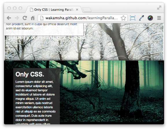
CSS実装のポイント
- 各セクションの背景画像をbackground-position: fixed;で固定配置する
- テキストやイメージ画像などのコンテンツをposition: absolute;で絶対配置する
これにより、ページをスクロールしても背景画像は動くことはなく、そのまま次のセクションの裏に隠れるといった表現が実現できます。
Copyright © ITmedia, Inc. All Rights Reserved.
SpecialPR
アイティメディアからのお知らせ
スポンサーからのお知らせPR
SpecialPR


注目のテーマ
システム開発ノウハウ 【発注ナビ】PR
あなたにおすすめの記事PR
 ITmediaはアイティメディア株式会社の登録商標です。